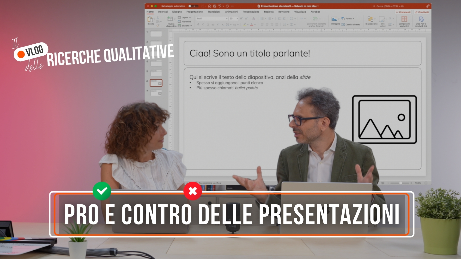
Until recently, presenting the results of research meant delivering a detailed deck report, in PowerPoint format, rather straightforwardly. It was the concluding moment of a long and complex work, and the goal was only one: to tell everything accurately.
The presentation was functional, designed for those already familiar with the topic, and was often dense with text, verbatim and technical explanations. The design was quite secondary, the important thing was that it was comprehensive, clear, and searchable.
This approach reflected a corporate and academic culture where research was seen as an exclusively analytical process: collect data, process it, present it. The value lay in rigorous methodology and completeness of information. Those who commissioned research expected to receive “everything.”
Then over time something changed.
The transformation began with changes in the world of work and in the way we consume information. The digital acceleration of the last few years has led to a real revolution in attention: we are bombarded with constant stimuli, accustomed to fast, visual and immediately understandable content.
Today's decision makers no longer have time to read 50-page reports. They have busy agendas the and need to make quick decisions based on clear, actionable insights. Pandemic has accelerated this process: video conferencing has reduced attention spans, necessitating more streamlined and engaging presentations.
In parallel, there has been a growing awareness that data, however accurate, does not automatically translate into action. It needs interpretation, context and, above all, a narrative that makes it meaningful to those who must use it. The concept of “data storytelling”-the art of turning numbers and statistics into understandable and memorable stories-has emerged.
Today the way of presentation has changed profoundly. The needs of principals and decision makers have evolved: they want to understand quickly, grasp key insights, and above all, remember them.
Presentations are becoming increasingly narrative. They are built like a narrative, with a strong thread, a clear point of view and direction. You start with a problem or question, develop the analysis like an investigation, and arrive at conclusions that have the flavor of a revelation. This narrative structure is not just a matter of style: well-told research creates logical connections that make the results easier to assimilate and remember
The use of images, clean slides and visual elements is no longer an embellishment, but an integral part of the communication strategy. Data visualization has become a discipline in its own right, with specific principles for turning complex numbers into instantly readable graphics. Modern slides follow design principles borrowed from the digital world: generous white space, readable fonts, colors that guide attention, iconography that supports the message. Each visual element has a specific purpose: to facilitate understanding, highlight key points, create a consistent visual experience.
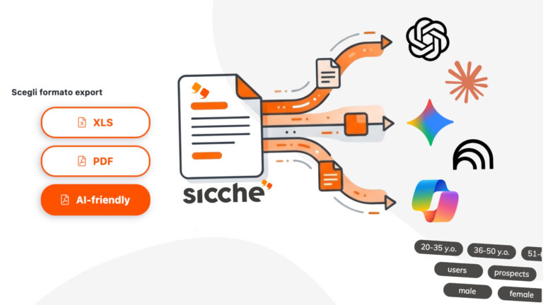
Emerging new formats: in many cases, PowerPoint gives way to innovative formats. Let's look at some examples:
In this scenario, the role of researchers is being redefined: we must also become communication designers, storytellers, experience architects! Because data alone are not enough. It is in how you tell the story that you really make a difference.
This transformation requires investment in new skills, tools and processes. But the return is clear: research that not only informs, but inspires, guides and generates change. In a world where information abounds and with AI everything seems to be becoming more “simplified,” even in identifying useful insights, being able to turn data into meaningful stories becomes a decisive competitive advantage.
The challenge for the future will be to maintain this balance: methodological rigor and communicative appeal, completeness of analysis and effective synthesis, technical professionalism and narrative creativity. Those who can master this synthesis will hold the key to turning any research into a tool for real change!
Watch the video below and learn how presentations are changing! 🚀 (EN subs included)